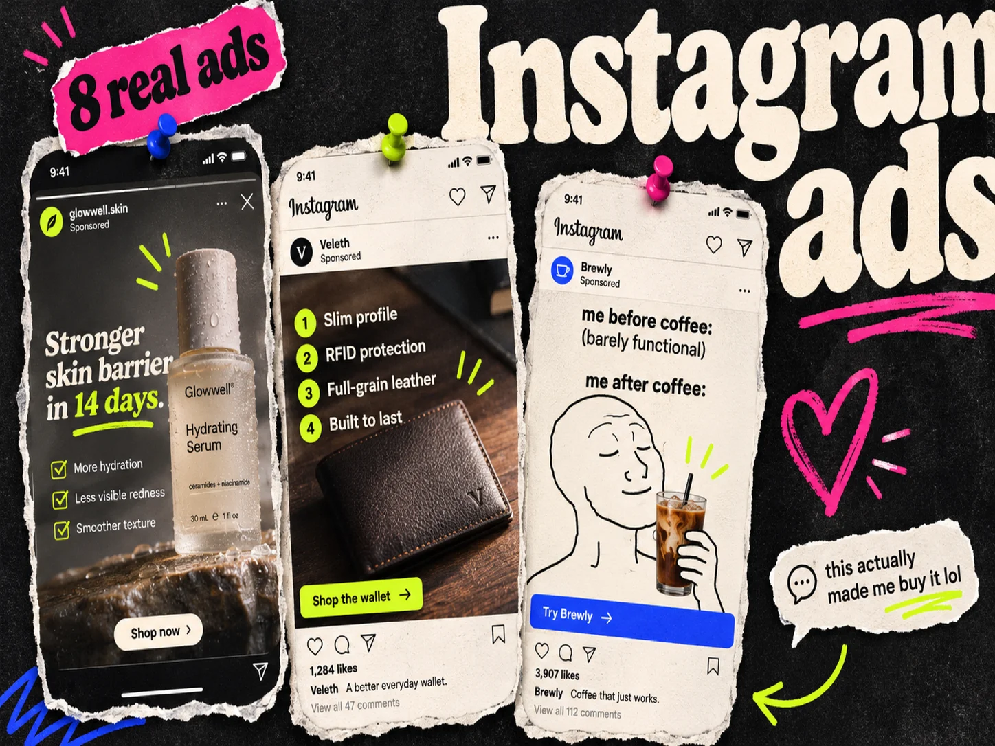
Most Instagram ad example roundups are walls of screenshots. You see the image, guess at the copy and the placement, and move on.
This one is narrower. Below are 8 ads that ran on Instagram placements, pulled from Adrio's ad library. For each one you get how long it ran, whether it is still running, and the placement versions the brand actually uploaded. We cannot see the results behind any of these ads, so read run length as a hint, not proof.
Quick list
| # | Brand | Format | Shape | Ran (days) |
|---|---|---|---|---|
| 1 | Dermalogica | Product photo with benefit text | Square feed + 9:16 Stories | 175 |
| 2 | RYZE Superfoods | Meme | 4:5 | 178 |
| 3 | Mindful Souls | Fake email screenshot | 9:16 | 181 |
| 4 | BetterMe | Quiz hook with schedule chart | Square | 233 |
| 5 | Duolingo | App install creative | Square + 4:5 + 1.91:1 | 172 |
| 6 | The Ridge | Numbered list | Square | 381 |
| 7 | Waterdrop | Product grid with benefit pills | 9:16 + square | 343 |
| 8 | FragranceX.com | Sale photo with large text | 9:16 | 521 |
1. Dermalogica: make a separate Stories cut
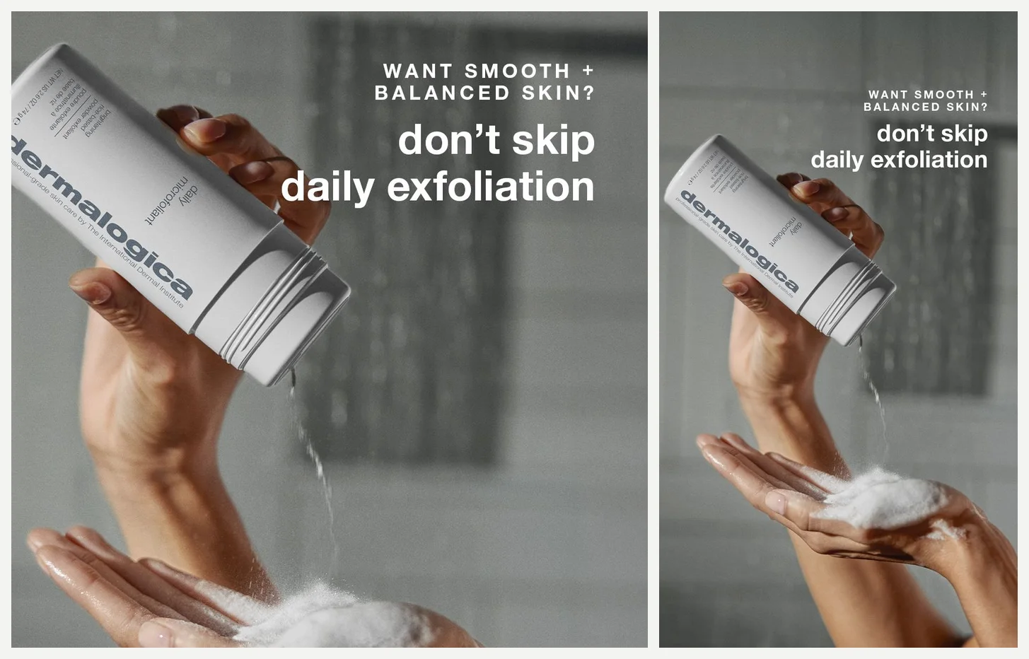
The shot is simple: a hand pours Daily Microfoliant powder into wet palms in a shower. The text "WANT SMOOTH + BALANCED SKIN? don't skip daily exfoliation" sits around it. What earns the example is the right half of the image. The same shot appears again in 9:16, with the text repositioned and resized for the tall frame.
Dermalogica could have uploaded one square file and let Meta crop it for Stories. It made a real second version instead. A crop can push a headline toward the safe zone edges or cut it off, so a dedicated 9:16 cut keeps the message intact in the placement where people hold the phone upright. The primary text stays short too: "Discover the gentle daily exfoliant your routine is missing. Add water, lather + rinse to reveal smoother, brighter skin with Daily Microfoliant." The headline is "Smooth + Brighten Skin Daily".
Ran only on Instagram. Started 2026-05-06, 175 days on record, still running.
What I would test:
- The square version with a taller text layout, to see whether the dedicated cut is worth the design time
- A version where the headline leads and the photo supports, instead of the reverse
- The same shot without the question line, keeping only "don't skip daily exfoliation"
2. RYZE Superfoods: let a meme carry the hook
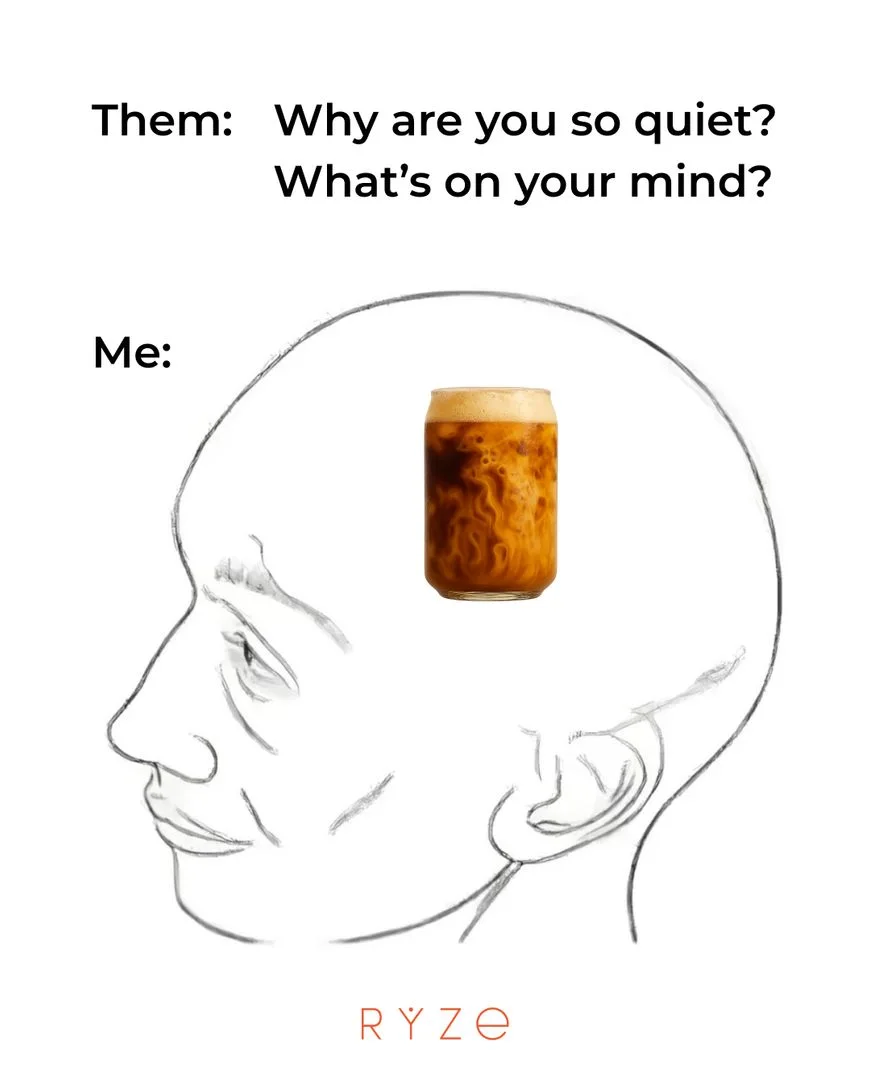
"Them: Why are you so quiet? What's on your mind?" then "Me:" above a line drawing of a head with a glass of RYZE mushroom coffee floating inside it. That is the whole ad, with a small logo at the bottom.
This looks like something a friend would send, not a designed ad. On Instagram that helps, because the feed is full of polished product shots that announce themselves as advertising. A meme does not. The joke only lands if the product is already known enough to be the punchline, which is a real constraint for newer brands.
Ran on Facebook and Instagram. Started 2026-03-09, 178 days on record, still running.
What I would test:
- The same template with a different everyday thought in the head
- A second meme format with the same white background
- A clean product photo in the same 4:5 shape, as the control
3. Mindful Souls: dress the ad as a leaked email
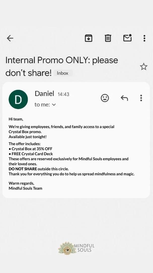
The image is built as a phone email screenshot. The subject reads "Internal Promo ONLY: please don't share!" and the sender is "Daniel". Below it sits a short note that reads like an internal memo about a crystal subscription offer.
The screenshot does two jobs at once. It earns a second look because it does not look like an ad, and it sets up the insider-deal frame the offer needs. Then the primary text does the plain selling: "Want to build a crystal collection that's truly unique and special? Introducing the Mindful Souls Crystal Subscription Box - no fakes, duplicates, or complications."
Whether a fake internal email fits your brand's standards is a separate question from whether it performs. It is a format to borrow with care.
Started 2026-02-20, 181 days on record, still running.
What I would test:
- The same offer as a plain product photo with the subscription terms visible
- The note as text-only, no screenshot styling
- A different subject line and sender name
4. BetterMe: turn the decision into a quiz
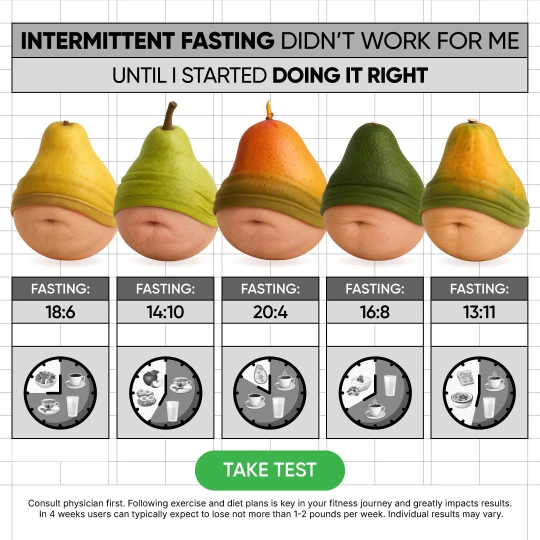
The headline starts with a failure: "INTERMITTENT FASTING DIDN'T WORK FOR ME UNTIL I STARTED DOING IT RIGHT". Below it, five pears in a row, each above a schedule: 18:6, 14:10, 20:4, 16:8 and 13:11. A green "TAKE TEST" button closes the ad, with small disclaimer text at the bottom.
The first line speaks to people who tried intermittent fasting and quit. The chart then reframes the failure: the schedule was wrong, not the person. The primary text is one short ask: "What type of intermittent fasting to choose? Take short test to find out."
A quiz ad needs the ad, the quiz, and the follow-up flow to line up, so it costs more to build than a static product shot. 233 days is a long run for a format with that much behind it.
Started 2025-06-01, ran 233 days, no longer active.
What I would test:
- Fewer schedule options on the chart
- The same chart without the failure-first headline
- The button copy swapped for a plan-outcome promise
5. Duolingo: ship one creative in three shapes
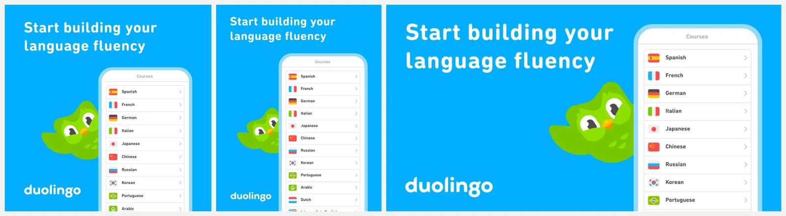
One design, three crops: square, 4:5, and a wide 1.91:1. Blue background, "Start building your language fluency", a phone showing the language list, and the green owl. Headline: "Free Language Learning". CTA: Install now. Primary text: "Learn a language for free with fun lessons designed to keep you motivated!"
This is the least glamorous ad in the set and possibly the most useful. The brand did not design three separate concepts. It made one creative that holds together in three shapes and let Ads Manager place it where it fits. For an app install campaign that keeps the ad set simple.
The wide 1.91:1 version is the interesting one, because that shape is the hardest to compose for and the layout still works. The important elements sit close to the center, which is what makes it survive.
Started 2026-02-18, ran 172 days, no longer active.
What I would test:
- The same creative with the owl larger or absent
- A 9:16 cut for Stories and Reels
- A headline that names a specific language
6. The Ridge: number the reasons to switch
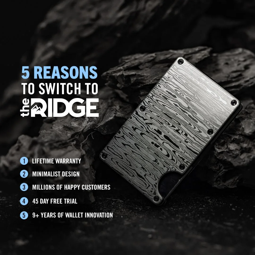
A textured metal wallet on dark stone, the headline "5 REASONS TO SWITCH TO THE RIDGE", and a numbered list: Lifetime warranty, Minimalist design, Millions of happy customers, 45 day free trial, 5+ years of wallet innovation.
This list approach is close to the benefit stacks in our Facebook static ad examples, but the job is different. Wallet buyers already own a wallet, so the ad argues against the status quo. The numbered list is that argument, and the count in the headline promises the argument has an end. If you would rather give each reason its own frame than stack them in one image, that is the job of a carousel ad.
The primary text opens with a strong claim: "Shop the best-selling wallet of all time and choose from over 30+ colors and styles."
Started 2024-09-05, ran 381 days, no longer active.
What I would test:
- The order of the five reasons
- Four reasons instead of five
- The same list over a lifestyle shot instead of the studio stone
7. Waterdrop: show the range, not one flavor
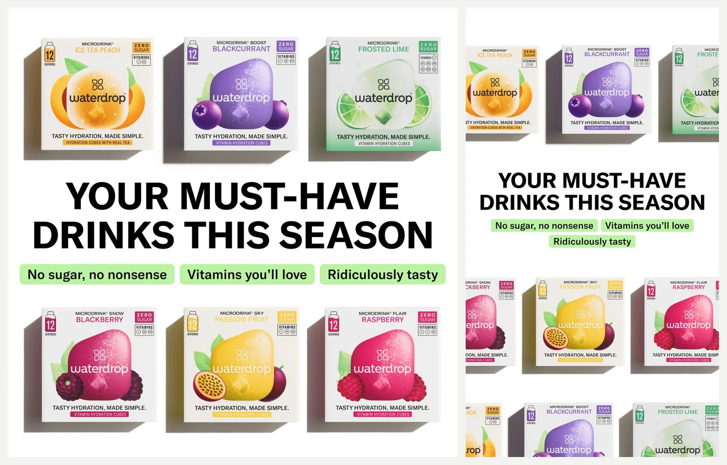
This one shows two versions side by side: 9:16 and square. Rows of colorful drink-cube boxes fill the frame under the headline "YOUR MUST-HAVE DRINKS THIS SEASON", with three green pills: "No sugar, no nonsense", "Vitamins you'll love", "Ridiculously tasty".
The grid of flavors does the selling for a product where choice is the point. A single box shot would ask the buyer to trust that one flavor is right for them. The rows make them start picking, and picking is a step closer to buying than admiring.
The headline "Drink More Water" does the category job while the pills do the persuasion. The primary text stays in list form: "Low calorie & sugar-free", "Real fruit & plant extracts", "Added vitamins".
Started 2025-03-26, ran 343 days, no longer active.
What I would test:
- One hero flavor against the full grid
- The three pills cut down to two
- A new seasonal headline on the same layout
8. FragranceX: lead with the discount in big yellow
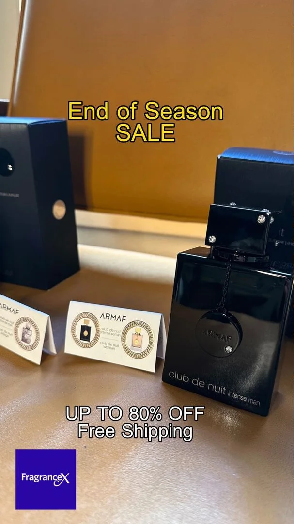
Designer perfume bottles on a table, and large yellow text: "End of Season SALE" and "UP TO 80% OFF Free Shipping". The logo sits bottom left. The headline adds "Plus Free Shipping!" and the primary text reads: "Get the perfect perfumes for this end of season at Fragrancex.com and get up to 80% off on designer brands".
Nothing here is subtle, and that is the point. A sale ad has one job: state the deal clearly enough that a shopper can decide in a second. The photo establishes the designer brands and the type states the number.
The long run is the surprise. A 521-day run for an end-of-season sale is odd, but simple ads with a clear offer can stay up for a long time.
Started 2024-09-20, ran 521 days, no longer active.
What I would test:
- The same image with the text smaller and the bottles larger
- A version without "Free Shipping" in the image itself
- Swapping the copy as seasons change while the layout stays
What these Instagram ads have in common
A few things, drawn only from the eight above.
First, several brands uploaded separate versions per placement instead of trusting the crop. Dermalogica repositioned and resized its text for Stories. Duolingo built one creative that holds in three shapes. Waterdrop shipped 9:16 and square. Three of the eight did the extra work.
Second, the native-looking formats earn their place. The RYZE meme and the Mindful Souls fake email are the two formats that look least like ads here, and both were still running after about six months.
Third, text is short and large almost everywhere. Even The Ridge, the most copy-heavy ad in the set, uses five short lines.
Fourth, none of the eight tries to explain the product in depth. Each commits to one move and leaves the rest to the landing page. If you want to see how the same discipline looks across static and video, our Meta ad formats guide breaks down which format carries which job.
Instagram ad sizes in one line each
- Feed: 1:1 (1080 x 1080) or 4:5 (1080 x 1350).
- Stories and Reels: 9:16 (1080 x 1920).
Those are the shapes every ad above was built for. For safe zones, text margins, and the rest of the placements, see our Meta ad sizes and dimensions guide.
Where Adrio fits
A roundup like this ages fast, because the screenshots stay fixed while the ads change. Adrio's ad library lets you search competitor Meta ads live, so you can find what is running in your category right now, check how long each ad has been up, and save the ones worth studying to boards.
From there you can turn a reference into editable on-brand ad variants, static or video, and export in 1:1, 4:5, and 9:16 so each placement gets its own cut instead of one file cropped three ways. There is a free trial if you want to test the flow on one of your own competitors first. For the research method in detail, start with our guide to finding winning ads in the Facebook Ad Library.
FAQ
What makes a good Instagram ad?
One idea, understandable in a glance. The strongest ads in this set each commit to a single move: a meme, a quiz, a numbered list, a discount stated plainly. Run length is a useful signal, since an ad that stays up for hundreds of days is usually one that someone keeps approving.
What size should Instagram ads be?
Feed ads use 1:1 (1080 x 1080) or 4:5 (1080 x 1350). Stories and Reels use 9:16 (1080 x 1920). If you build only one file, start with the placement where most of your audience sits and check what the crop does to the other one.
Do Instagram ads need separate Stories creative?
The examples above suggest brands that care about Stories upload a dedicated 9:16 cut instead of trusting the crop. Meta can place one file across several placements, but a square file squeezed into a vertical frame can leave the text sitting awkwardly or cut it. Testing one campaign both ways tells you whether the second cut is worth it for your account.
Where can I see competitors' Instagram ads?
The Meta Ad Library shows active ads for any Page, so you can search a competitor and browse what they are running. Adrio's library adds search across advertisers, saving to boards, and run length on top of that.
Are Instagram ads and Facebook ads the same?
Both are bought in Meta Ads Manager, and one ad can run on both placements at once. What differs is shape and context: feed ads on Instagram use 1:1 or 4:5, Stories and Reels use 9:16, and the same file can read differently in each placement. That is why several brands in this list uploaded separate versions rather than one crop.