A Facebook carousel ad is one ad with 2 to 10 swipeable cards. Each card carries its own image or video, headline, description, and link, so a single ad can show a product range, a story, or a sequence of reasons to buy.
The 7 examples below are real carousel ads pulled from Adrio's ad library, with the actual cards shown. We can see what the cards say and how long each ad ran; we cannot see clicks, sales, or return on ad spend. Run length is not a performance metric, but an ad left up for months is at least worth studying.
Facebook carousel ad specs
| Spec | What Meta allows | Practical note |
|---|---|---|
| Number of cards | 2 to 10 per carousel | Every card has to earn its slot. |
| Per-card content | Its own image or video, headline, description, and link | Keep card headlines to a few words; limits differ by placement, so check the preview. |
| Feed card image | 1:1 ratio, 1080 x 1080 px | Square is the safest default for feed. |
| Stories and Reels | 9:16 ratio, 1080 x 1920 px | Plan vertical cards; square cards do not fill the screen. |
| Image file size | Up to 30 MB per card | The crop matters more than the file size. |
| Video file size | Up to 4 GB per card | Enough for most product clips. |
| Primary text | Starts to truncate around 125 characters on mobile | Treat 125 as a practical limit; the first sentence should work alone. |
| Placements | Facebook and Instagram, including Instagram feed and Stories | Preview each placement, since card ratios differ. |
Those numbers cover the carousel itself. For every other placement size, see our guide to Meta ad sizes and dimensions.
What real carousel ads look like
Adrio's ad library holds 241,195 Meta ads. 10,496 of them are carousel ads, from 155 advertisers.
About 60% of carousel card images are square (1:1) and about 14% are 4:5. The rest spread across other portrait and horizontal shapes, as several examples below show.
34.7% of the carousel ads in the library ran 30 days or more, against 25.6% of single image ads and 12.8% of video ads. The caveat: this is our sample of tracked advertisers, and run length is not proof carousels perform better. A long run can mean an ad works, or that it is cheap to keep on, or that nobody turned it off.
7 Facebook carousel ad examples
1. Dr. Squatch: show the whole range
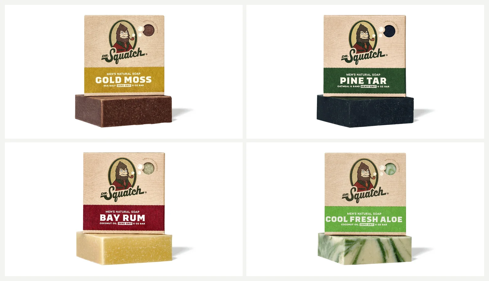
The ad has 6 cards, and the image shows the first 4. Each shows a bar and its box on white, titled with the scent name and "- Natural Soap": Gold Moss, Pine Tar, Bay Rum, Cool Fresh Aloe, then Alpine Sage and Grapefruit IPA. The description repeats on every card: "Get great skin with our natural bar soap". The primary text carries the brand line: "Simply good natural soap formulated for men".
The plainest carousel structure there is: one product per card. A viewer who stops after card 2 has still seen a product and a reason.
Ran for 232 days. No longer active.
What I would test:
- Scent-specific card descriptions instead of the repeated one
- The order of scents; the first card decides who keeps swiping
2. Happy Mammoth: tell one story across the swipe

The 4 cards form one continuous illustration: a man's belly shrinks from card to card, and the last card reveals the supplement bottle labeled "T - breakthrough, Beer belly destroyer!". Titles carry the story: "Dad bod is going...", "...going...", "...GONE!", "Get yours NOW". The primary text opens "9 out of 10 men have no clue what andropause is...".
The structure is what is interesting, not the health claims, which I would not repeat without evidence. The swipe becomes a before-and-after with a cliffhanger: a static ad can put two states side by side, a carousel makes the reader walk between them.
Ran for 107 days. No longer active.
What I would test:
- Whether the story survives in 3 cards instead of 4
- Card titles that make sense when one card is seen alone
3. Frøya Organics: answer one objection per card

The 4 visible cards are vertical 9:16: three close-up selfies of women's skin, then a woman in a white coat presenting jars. Card titles take on one claim or objection each: "Your skincare is making you age faster", "Retinol thins your skin [Try the real fix]", "Do less skincare and get it at 40% off now!", and "Stop the damage and regrow your skin barrier now!". The primary text opens: "It started with a few fine lines. Nothing serious, just little reminders that time was passing."
The claims are the brand's, and I would not vouch for them. Worth borrowing is the structure: every card handles one objection, so a skeptical viewer can find the argument that speaks to them. The 9:16 cards suggest Stories and Reels came first.
Started 2025-05-27. Ran for 489 days and is still running.
What I would test:
- The order of the objections
- Square 1:1 versions of the same cards for feed
4. Carved: let the headlines carry the reasons to buy
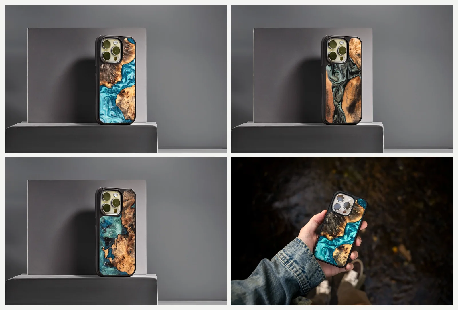
The ad runs 10 cards, and the image shows the first 4. Three show wood-and-resin phone cases on a grey plinth, one shows a case in a hand outdoors at night. Titles rotate through four reasons to buy: "New iPhone 15 Cases", "Handmade in The USA", "Crafted from Genuine Wood", "Each Case is a 'One of One' Design". The primary text reads "Your Dream iPhone 15 Case is Here - Grab It Before It's Gone!" followed by the same three points.
The images show variety. The headlines sell. Each is a distinct reason to pick a wooden case over a plastic one, and with 10 cards the rotation can repeat.
Ran for 65 days and is still running.
What I would test:
- Cards that show the feature each headline names, instead of similar product shots
- A lead card that states the strongest reason, not the product name
5. Happy Socks: bring visitors back with an offer
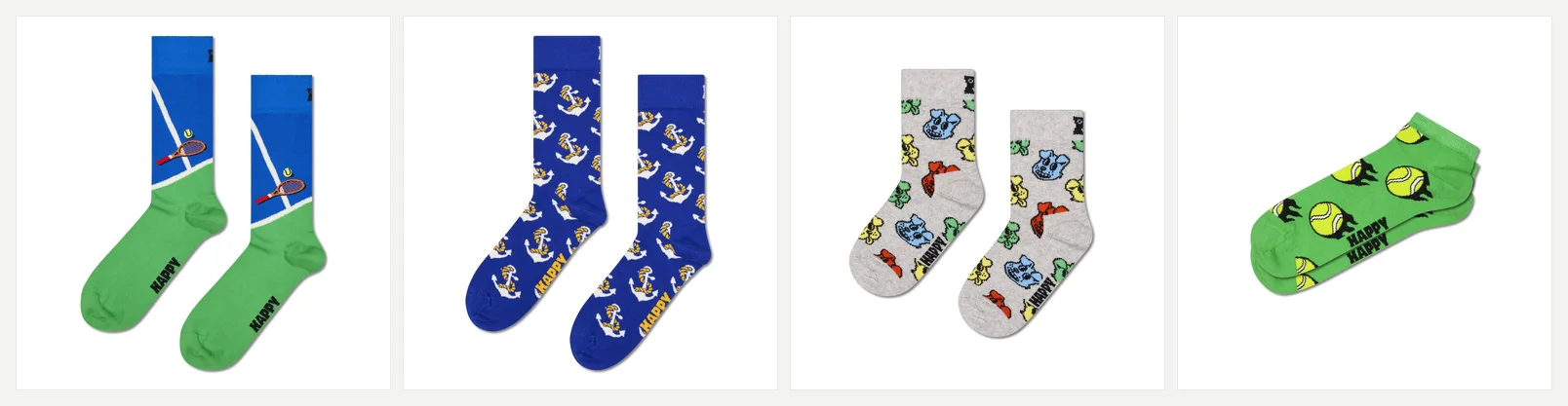
The 4 visible cards are single sock pairs on white: a tennis sock, an anchor sock, a kids dog sock, and a tennis-ball low sock. Titles include the price, like "Tennis Sock A$19.95" and "Kids Doggo Sock A$12.95". The primary text reads: "Left without your Happy Socks? Come back and save 20% off your first order if you sign up."
This is retargeting with the pieces separated cleanly: the primary text carries the offer, the cards carry the browsable products, and the prices sit in the titles so a click is a qualified one.
Ran for 229 days and is still running.
What I would test:
- Card titles without prices, to see what the price line costs in clicks
- The offer on the first card for readers who never swipe
6. Mid-Day Squares: one benefit per card

The 4 visible cards are portrait 4:5: lifestyle photos of people in bright pink outfits holding heart-shaped boxes of the bars, plus one flat shot of a red heart box full of bars. Card titles split the job: "6g Protein | Real Chocolate", "Fuel On The Go", and "Satisfy Your Sweet Craving". The primary text riffs on the box: "Life is a box of chocolates, sometimes you have to take a bite to discover the deliciousness inside!"
This is the benefit stack from static ads, spread across cards instead of crammed into one image. Each card carries one reason to buy and the photography does the rest. The taller cards give the lifestyle shots room.
Started 2025-12-18. Ran for 245 days and is still running.
What I would test:
- A square version with the same three benefits, to see if the crop matters
- Benefit order, with the craving card first for impulse buyers
7. We're Not Really Strangers: sell a line where the box is the brand
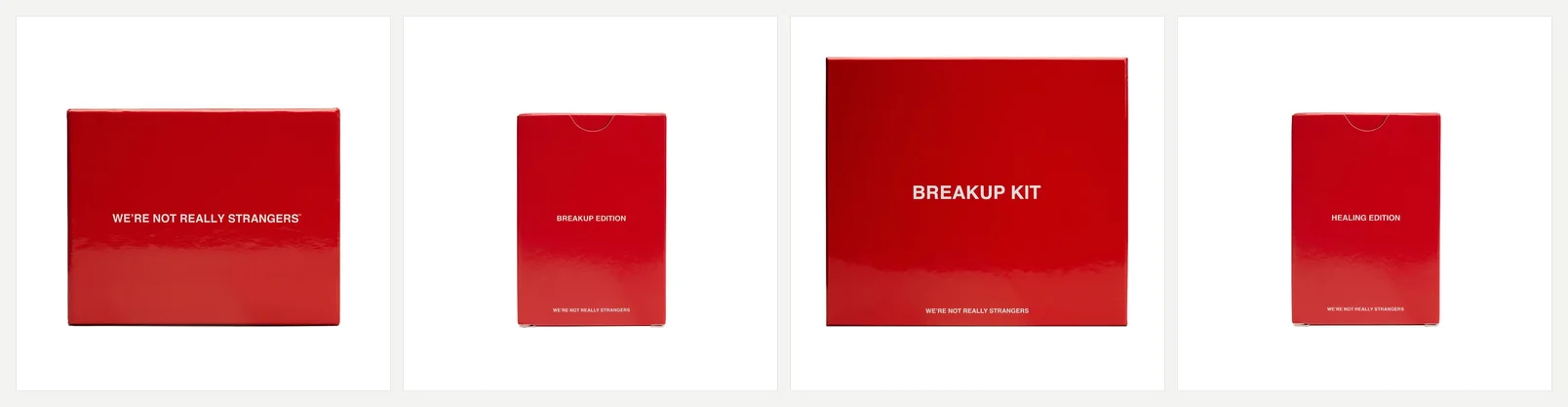
The 4 visible cards show red boxes on white: the main card game, Breakup Edition, Breakup Kit, and Healing Edition. The full ad has 6, adding Couples Edition and Kids Edition. The primary text is one line: "don't lose touch. shop our card games at werenotreallystrangers.com".
Near-identical cards are usually the mistake I warn about below. Here they work, because the box design is the brand. The only real difference between cards is the edition name, and that is the point: one recognizable product multiplied into variants.
Ran for 45 days and is still running.
What I would test:
- A card that shows the game in use, not another box shot
- A lead card with all 6 boxes together
When a carousel is the right format
Reach for a carousel when you have several things to show: a product range, a story, several distinct reasons to buy, or priced products a visitor should browse. If the cards would repeat the same message, the format adds nothing.
A single image is better when one idea carries the ad. Split that idea across cards and you make the reader work for what one frame could deliver. Video is better when motion explains the product, like a demonstration or a transformation over time. Our guides to Meta ad formats and static ads versus video ads go deeper.
How to set up a carousel ad in Ads Manager
- 1.Create or open the campaign the carousel will live in.
- 2.At the ad level, choose Carousel as the format.
- 3.Add between 2 and 10 cards.
- 4.For each card, set an image or video, plus a headline, description, and link.
- 5.Find the setting that controls whether Meta can automatically show the cards it decides are best performing first. Decide whether you want it on; if your card order tells a story, check how it behaves first.
- 6.Preview each placement. Feed uses 1:1 cards, Stories and Reels use 9:16.
- 7.Publish.
Carousel mistakes to avoid
- Treating the first card as an intro. Some people only see it, so it must carry the offer or hook alone.
- Repeating card headlines with no new information between them. Carved rotates headlines because each is a different reason to buy; Dr. Squatch repeats a description because the scent names change. If nothing changes, cut cards.
- Mixing shapes across cards. Every example above keeps one shape for all its cards. Pick one shape per carousel so no card gets an awkward crop.
- Writing primary text that falls apart after 125 characters. Mobile truncates around there, so the first sentence has to stand alone.
- Building only for feed. On Instagram Stories or Reels, square cards do not fill the screen, so plan a 9:16 version or check how the placement looks in preview.
Where Adrio fits
Adrio is built for the research step before any of this. You can search competitor Meta ads in its ad library, save carousels to boards, and turn a reference into editable on-brand ad variants, static and video. Exports come in 1:1, 4:5, and 9:16. There is a free trial.
The carousel ads counted above come from that library, so you can study competitors' card structures before you brief your own. For the full research process, see finding winning ads in the Facebook Ad Library.
FAQ
What is a Facebook carousel ad?
A Facebook carousel ad is one ad made up of 2 to 10 swipeable cards, each with its own image or video, headline, description, and link. Brands use it to show product ranges, stories, or several reasons to buy.
How many cards can a carousel ad have?
Meta allows 2 to 10 cards per carousel. More cards is not automatically better; every card needs its own job.
What size should carousel images be?
Feed cards use a 1:1 ratio at 1080 x 1080 px; Stories and Reels placements use 9:16 at 1080 x 1920 px. If you prepare only one shape, square is the safer default, but preview the full-screen placements.
Can carousel ads use video?
Yes. Each card can hold either an image or a video, up to 4 GB per card.
Do carousel ads work on Instagram?
Yes. Carousel ads can run on Facebook and Instagram placements, including Instagram feed and Stories. Card ratios differ by placement, so prepare 1:1 for feed and 9:16 for Stories.
Are carousel ads better than single image ads?
There is no universal winner. Carousels fit when you have several things to show; a single image fits when one idea carries the ad. In Adrio's library, 34.7% of carousel ads ran 30 days or more versus 25.6% of single image ads, though that is not proof of performance.