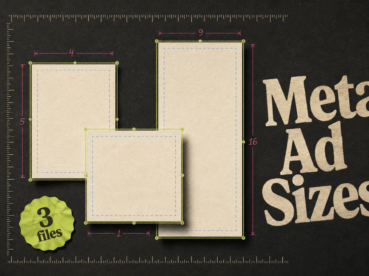
You do not need fifteen exports for one Meta ad. For most static campaigns, three files cover the practical work:
- 1080 x 1350 for Feed
- 1080 x 1080 for square placements
- 1080 x 1920 for Stories and Reels
Meta can accept other dimensions and crop assets automatically. That does not mean the crop will protect your headline, product, or CTA. I would rather give the system three deliberate compositions than hope it turns one square into a decent full-screen ad.
Meta ad size cheat sheet
| Use | Working size | Aspect ratio | Design note |
|---|---|---|---|
| Facebook and Instagram Feed | 1080 x 1350 | 4:5 | Best default for mobile Feed |
| Square placements and carousels | 1080 x 1080 | 1:1 | Easy to reuse across placements |
| Stories and Reels | 1080 x 1920 | 9:16 | Keep text and logos clear of interface elements |
| Landscape link creative | 1200 x 628 | 1.91:1 | Use when the placement or preview calls for landscape |
Meta's own campaign guidance recommends 4:5 for Feed and 9:16 for Stories and Reels. Instagram preserves photos up to 1080 pixels wide when they fall within its supported aspect-ratio range, although Ads Manager may apply placement-specific crops and treatments.
The sizes above are working files, not a promise that every placement displays every pixel. Preview the ad inside Ads Manager before publishing.
1080 x 1350: the Feed file
A 4:5 ad uses more vertical space in a mobile feed than a square. That extra height is useful, but it is easy to waste.
Do not stretch the background and leave the product floating in the middle. Recompose the ad for the taller canvas:
- Move the hook into the upper third
- Give the product enough height to feel intentional
- Keep the CTA or offer away from the bottom edge
- Check that small proof text survives on a phone
Meta recommends 4:5 for Feed creative in its campaign guidance. The same ratio also fits Instagram's supported portrait range.

The example above makes good use of the tall frame. The headline gets space, the product remains large, and the proof sits close to the object it supports. Cropping this into a square would remove useful breathing room, so the square version needs a new composition.
1080 x 1080: the square file
Square is still useful because it travels well. It is a sensible base for carousels, Marketplace-style placements, and any surface where a portrait asset may be cropped.
The mistake is treating the square as the master design for everything. A square can become a weak 9:16 ad very quickly: tiny product in the centre, empty space above, empty space below.
Use the square version as coverage, not as an excuse to skip the other ratios.
A reliable square composition usually has:
- One hook that reads without zooming
- One focal image
- Proof or an offer close to the product
- Enough margin to survive small crops
If the ad contains a comparison table or several benefits, check it at actual phone size. Designers work zoomed in. Customers do not.
1080 x 1920: the Stories and Reels file
Stories and Reels use a full-screen 9:16 frame. Meta also offers image expansion and placement adjustments through Advantage+ creative, but automatic expansion cannot decide where your message should sit.
Meta's Reels ad guidance recommends keeping key messages inside the safe zone. Profile information, captions, reactions, and CTA controls can cover the edges of the frame. The exact interface changes by placement and device, so there is no permanent pixel rectangle that removes the need to preview.
Use this practical rule:
Keep the hook, product, proof, logo, and CTA away from the extreme top and bottom. Treat the centre of the frame as the reliable area.
Do not place a second fake CTA where Meta will add the real one. Two buttons stacked near the bottom look messy and can make the action less clear.
Meta allows image ads in Reels, but its guidance favours creative built for the placement. For static production, that means a proper vertical composition rather than a square image padded to 9:16.
What a safe zone really means
A safe zone is the part of the canvas least likely to be covered by the app interface. It is not a decorative border and it is not identical across every placement.
Put these elements inside the safe area:
- Main headline
- Product name
- Price or offer
- Logo
- Legal text that must remain visible
Background photography can extend to the edges. Important faces, product details, and comparison labels should not.
The easiest check is brutally simple: open the placement preview in Ads Manager. Look at Feed, Stories, and Reels separately. If the product name sits under a button, fix the source file rather than trusting the platform to move it.
Should you let Meta resize one image?
Sometimes.
Automatic resizing is useful when the source image has plenty of background and one obvious focal point. A product on a clean studio backdrop can expand well. A comparison ad with tight columns usually cannot.
Let Meta adapt the image when:
- The background can extend naturally
- Text occupies a small central area
- The product has space around it
- A slightly different crop does not change the idea
Create separate files when:
- The ad has text near an edge
- The layout uses columns or before-and-after panels
- The product touches the frame
- The CTA is built into the image
- Cropping changes the order in which the ad is read
Advantage+ creative can save production time. It cannot rescue a composition that only works at one ratio.
One concept, three compositions
The message should stay stable across sizes even when the layout moves.
Imagine a skincare ad with:
- Hook: "Calm redness without covering it"
- Product: serum bottle
- Proof: customer before-and-after
- CTA: shop now
In 4:5, the before-and-after can sit above the product. In 1:1, it may need to move beside it. In 9:16, the hook can sit at the top of the safe area with the proof and product stacked below.
That is still one creative concept. You are adapting the reading order, not inventing three campaigns.
File quality and export settings
Use a high-resolution source and export text-heavy static ads as PNG when crisp type matters. JPG is fine for photography if compression does not introduce visible artifacts.
Before upload:
- 1.Check the file at 100% size.
- 2.Check it again at roughly phone width.
- 3.Confirm that small text is still readable.
- 4.Look for compression around logos and type.
- 5.Open all three placement previews in Ads Manager.
If an ad needs pinching and zooming to understand, the problem is not the file format.
The fastest practical workflow
Start with the 4:5 Feed version because it gives you enough room to establish the hierarchy. Once that works:
- 1.Recompose it into 1:1.
- 2.Build a real 9:16 version.
- 3.Preview all placements.
- 4.Fix any covered text or awkward crops.
- 5.Export the final set together.
Do not wait until launch day to discover that the vertical version needs a different product shot.
Where Adrio fits
Adrio creates and exports static ads in 1:1, 4:5, and 9:16. The useful bit is that the logo, CTA, product, and text remain editable while the format changes.
That makes one concept easier to ship across Meta placements without flattening every version into the same square composition. For ideas on what the ad itself should say, see our Facebook static ad examples.
FAQ
What is the best size for a Facebook Feed ad? Use 1080 x 1350 at 4:5 as the main mobile Feed file. A 1080 x 1080 square is still useful for broader placement coverage.
What size should an Instagram ad be? Use 1080 x 1350 for portrait Feed ads, 1080 x 1080 for square, and 1080 x 1920 for Stories and Reels.
What is the correct Reels ad size? Build Reels creative at 1080 x 1920 in a 9:16 aspect ratio. Keep important text, logos, and products away from interface controls near the edges.
Can I upload one image for every Meta placement? Yes, and Meta may crop or expand it. Separate 4:5, 1:1, and 9:16 files give you more control over the message and reading order.
Should Facebook ads be PNG or JPG? PNG is a good choice for text-heavy graphics and sharp logos. JPG works well for photography when exported at high quality.
Does changing the aspect ratio count as a new creative test? Usually no. It is a placement adaptation of the same concept. Treat it as a new test only if the new composition materially changes the message or visual idea.