The best Meta ad format is the one that makes the buyer understand the offer before they scroll. For static ads in 2026, that usually means a simple visual hierarchy, one clear hook, one proof point, and a CTA that fits the placement.
Meta's Advantage+ placements can distribute ads across Facebook, Instagram, Messenger, Reels, Stories, and Audience Network. That does not mean one crop works everywhere. Strong accounts still prepare static creative for feed, square, and vertical placements so the message survives cropping.
TL;DR
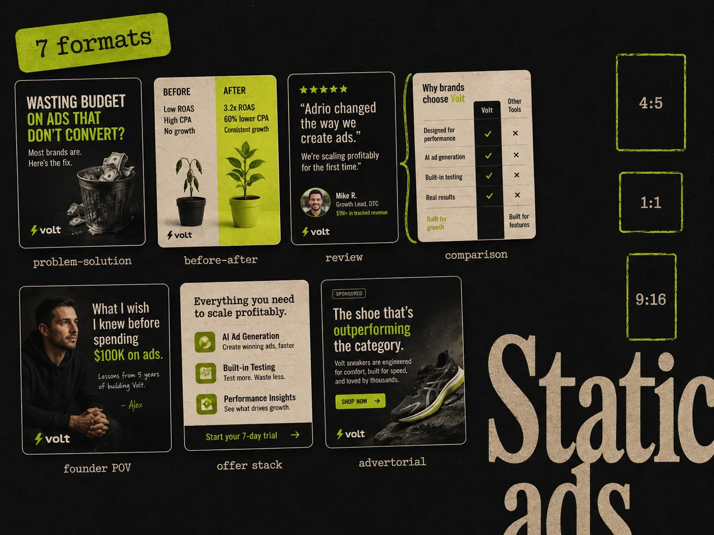
The best Meta static ad formats in 2026 are problem-solution, before-after, review or testimonial, comparison, founder POV, offer stack, and advertorial-style static. For placements, build 4:5 for feeds, 9:16 for Stories and Reels, and 1:1 for square-safe placements. The creative format should change by angle, but the message hierarchy should stay clear.
| Format | Best for | Core structure |
|---|---|---|
| Problem-solution | Cold traffic | Pain point, product, outcome |
| Before-after | Visual products | Current state, improved state, proof |
| Review or testimonial | Trust building | Quote, product, customer context |
| Comparison | Competitive markets | Old way vs new way |
| Founder POV | Differentiated brands | Personal insight, product reason, CTA |
| Offer stack | Promotions | Bundle, savings, urgency |
| Advertorial static | Education-heavy products | Headline, mini-story, proof, CTA |
1. Problem-solution static
The problem-solution format is the safest cold-traffic format because it tells the buyer why they should care before it asks for attention.
Structure:
- Hook: name the problem in plain language
- Visual: product or use case
- Proof: one specific result, feature, or reason to believe
- CTA: simple next step
Example structure:
Still making ad variants one by one?
Generate 10 branded Meta statics from one product in minutes.
Use this format when the audience is problem-aware but does not yet know your product. It works especially well for SaaS, beauty, supplements, productivity, finance, and ecommerce products with a clear pain point.
Best test variable: hook.
2. Before-after static
Before-after ads work because they reduce the pitch to a visible contrast. The format does not need a literal transformation photo. The "before" can be a workflow, dashboard, routine, or feeling.
Structure:
- Left side: the old state
- Right side: the improved state
- Caption: why the product creates the change
- CTA: what to do next
Use this format when the result can be understood visually. For physical products, this might be skin, posture, storage, setup, styling, or cleaning. For software, it might be "before: 3 tools and 2 hours" versus "after: one canvas and 60 seconds."
Best test variable: visual contrast.
3. Review or testimonial static
A review ad borrows trust from the customer. It is strongest when the quote is specific. "Love it" is weak. "Cut our weekly creative production from 6 hours to 45 minutes" is strong.
Structure:
- Customer quote as the hook
- Product visual or customer context
- One proof detail
- Brand and CTA
Use this format when:
- The product has strong reviews
- The buyer needs reassurance
- The claim sounds stronger coming from a customer
- The audience has seen the brand before
If you do not have named testimonials, use a product-specific proof point instead of inventing fake social proof. Trust matters more than polish.
Best test variable: quote.
4. Comparison static
Comparison ads are useful when the buyer already has a default behavior. The default might be Canva, an agency, a spreadsheet, a manual process, or doing nothing.
Structure:
- Two columns: old way vs new way
- 3 to 5 comparison rows
- Product shown as the new way
- CTA at the bottom
Use this format when your value is easier to understand against an alternative. It is especially useful for software, subscription products, services, and workflow tools.
Good comparison rows:
- Time to first output
- Number of tools needed
- Cost per asset
- Skill required
- Control after generation
Best test variable: comparison object. Test against Canva, agencies, general AI, or manual design depending on what your buyer actually uses today.
5. Founder POV static
Founder POV ads work when the product has a strong reason to exist. This is not a corporate brand ad. It should feel like a sharp observation from someone who understands the buyer's problem.
Structure:
- POV hook: "We built this because..."
- One sentence about the old pain
- Product or workflow proof
- CTA
Use it when:
- The founder has real domain credibility
- The product is opinionated
- The market is crowded with generic tools
- The story helps explain why the product is different
Example:
We were tired of AI ad tools that made pretty images but no testable Meta ads. So we built the workflow around variants, references, and editable static ads.
Best test variable: opening POV.
6. Offer stack static
Offer stack ads are built for conversion moments. The job is not deep education. The job is to make the offer feel concrete and easy to act on.
Structure:
- Main offer
- 3 to 5 included items
- Price, savings, or deadline
- Risk reversal if true
- CTA
Use this format for launches, seasonal campaigns, bundles, lead magnets, free trials, and promotional pushes. It can work cold, but it is usually stronger for warm or retargeting audiences because those buyers already understand the category.
Best test variable: offer framing.
7. Advertorial-style static
Advertorial statics look like a small editorial card. They work when the product requires a little education before the click.
Structure:
- Headline that sounds like a useful article
- Product or situation visual
- 2 to 3 bullet points
- Proof or source
- CTA
Use this format for:
- Supplements
- Skincare
- SaaS
- Finance
- High-consideration ecommerce
- Products with a mechanism buyers need to understand
The trick is to keep it scannable. If the ad becomes a wall of text, it loses the benefit of a static visual.
Best test variable: editorial headline.
Best aspect ratios for Meta static ads
For static creative, prepare three sizes:
- 4:5 portrait: best default for Facebook and Instagram feed because it uses more mobile screen height than 1:1.
- 9:16 vertical: needed for Stories and Reels-style placements. Keep key text away from top and bottom UI zones.
- 1:1 square: useful for carousel, marketplace, right column, and square-safe variants.
Meta's automation can find placement opportunities, but the creative still needs to fit the surface. If you only upload one crop, Meta may crop or pad it in ways that weaken the message.
Best format by funnel stage
For cold traffic:
- Problem-solution
- Before-after
- Comparison
- Advertorial static
For warm traffic:
- Review or testimonial
- Offer stack
- Founder POV
For retargeting:
- Offer stack
- Review or testimonial
- Comparison against objections
For creative testing:
- Problem-solution for hook tests
- Comparison for positioning tests
- Before-after for visual tests
- Offer stack for promo tests
How to build a 7-ad static test
Start with one product and one offer. Then build:
- 1.Two problem-solution variants with different hooks.
- 2.One before-after variant.
- 3.One review or proof variant.
- 4.One comparison variant.
- 5.One founder POV or contrarian variant.
- 6.One offer stack variant.
Keep the audience, offer, and CTA consistent. Change the creative format, not everything else. After 5 to 10 days, look for which format earns the strongest CTR and CPA together.
For a deeper testing framework, see our guide to creative testing.
Where Adrio fits
Adrio helps you turn these formats into editable static ads quickly. Instead of rebuilding each layout manually in Canva or Figma, you can generate multiple Meta-ready variants from a product, brand, angle, or competitor-inspired structure.
That matters because format knowledge is only useful if you can ship it. The winning format is usually found through volume, not debate.
FAQ
What is the best Meta ad format for cold traffic? Problem-solution is the safest cold-traffic static format because it quickly connects a pain point to the product. Before-after and comparison formats are also strong when the visual contrast is clear.
Should Meta static ads be 1:1 or 4:5? Use 4:5 for feed-first static ads, 9:16 for Stories and Reels placements, and 1:1 when you need square-safe coverage. Most teams should create all three.
Do static ads still work on Meta in 2026? Yes. Static ads still work when the concept is sharp, the message is readable, and the account tests enough variants. Video is important, but static is faster to produce and useful for high-volume testing.
How many static ad formats should I test? Start with 4 to 7 formats around one offer. That gives enough variety to learn without splitting budget across too many disconnected concepts.
What is the biggest static ad mistake? Trying to say too much. A static ad should make one promise, show one product or proof point, and drive one action.