A creative preview tool has one job: show what the ad will look like when Meta places it around real interface elements.
The canvas in Canva, Figma, or an ad generator cannot answer that on its own. It shows the source creative. It does not show the Page identity, primary text, headline, call-to-action button, or the controls that sit over Stories and Reels. Meta Ads Manager gets closer to the delivered ad, but even that preview can change when you enable automatic crops, music, text changes, or other creative enhancements.
Use two previews. Review the source files first, then run the assembled ad through Meta's placement previews before launch. One tool rarely catches both kinds of mistake.
What a creative preview tool should show
Start by deciding which problems the preview needs to catch. A useful Meta ad preview should let you inspect:
- The actual crop for Feed, Stories, and Reels
- Text and logos near interface controls
- The Page or Instagram identity attached to the ad
- Primary text, headline, description, and CTA together
- The destination URL and display link
- Any automatic creative enhancements that may change the asset
A clean 1080 x 1920 export is not yet an ad preview. It is the media file. The finished ad includes platform chrome, copy outside the image, and sometimes a treatment you did not design.
If you only need to check whether a headline fits the image, the design canvas is enough. If you need launch approval, use the assembled placement preview.
The four preview tools that matter
1. Your design canvas
Canva, Figma, Adobe Express, and paid-social creative tools are best for reviewing the source asset. They expose weak hierarchy, tiny type, soft logos, awkward spacing, and products that disappear at phone size.
Check the asset at roughly the size it will occupy on a phone. Designers often approve ads while zoomed to 100% on a large monitor. A legal line that looks comfortable there can become a grey smudge in Feed.
The design canvas is also the right place to compare all exported sizes side by side. For most Meta static work, that means:
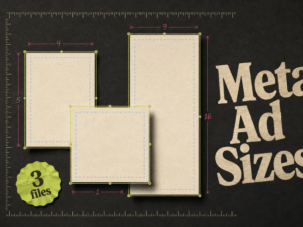
- 1080 x 1350 at 4:5 for Feed
- 1080 x 1080 at 1:1 for square coverage
- 1080 x 1920 at 9:16 for Stories and Reels
These should be three compositions of the same idea, not one square file with extra background pasted above and below. Our Meta ad sizes guide explains where each file fits.
What the canvas cannot tell you is how Meta will assemble the rest of the ad. It has no knowledge of the selected Page, CTA, destination, or enabled enhancements.
2. Meta Ads Manager preview
Ads Manager is the final pre-launch check because it has the campaign's real inputs. Once the identity, media, copy, CTA, destination, and placements are set, review each placement from the ad level.
Do not glance at one Feed card and assume the rest are fine. Move through the placement list. A portrait image can look clean in Instagram Feed and still lose its headline under the controls in Reels. A square image may be acceptable in one Facebook surface and feel cramped in a full-screen placement.
Ads Manager is also where copy problems become obvious. Primary text that seemed short in a document may push the useful sentence below the fold. A headline can repeat the words already baked into the image. A CTA may promise one action while the landing page asks for another.
Treat the preview as the closest available representation, not a screenshot guarantee. Devices, app versions, placements, and automatic treatments can change the final rendering.
3. Meta Creative Hub, when your account uses it
Creative Hub is useful earlier, when a team wants a Meta-style mockup before the ad is tied to a live campaign. It can help a client or stakeholder review the idea in context instead of commenting on a naked PNG.
Its role is approval, not launch validation. Once the ad has a real Page identity, URL, CTA, and enhancement settings, check it again in Ads Manager. If Creative Hub is not available in your current Meta workflow, do not build a process around it. A design review followed by Ads Manager preview covers the important ground.
4. A real phone
The least glamorous preview tool is often the most useful. Put the preview on a phone and hold it at a normal distance.
Look for the things a desktop review hides:
- Can you read the hook without zooming?
- Is the product obvious in the first glance?
- Does the proof look like proof, or like fine print?
- Are the logo and offer separated from the app controls?
- Does the CTA feel like the next step promised by the ad?
You do not need a formal usability study for this pass. Ten seconds on a phone catches a surprising number of ads designed for the designer's monitor instead of the customer's screen.
A pre-launch preview checklist
Run this check after the creative is approved but before the ad is allowed to spend.
Check the source files
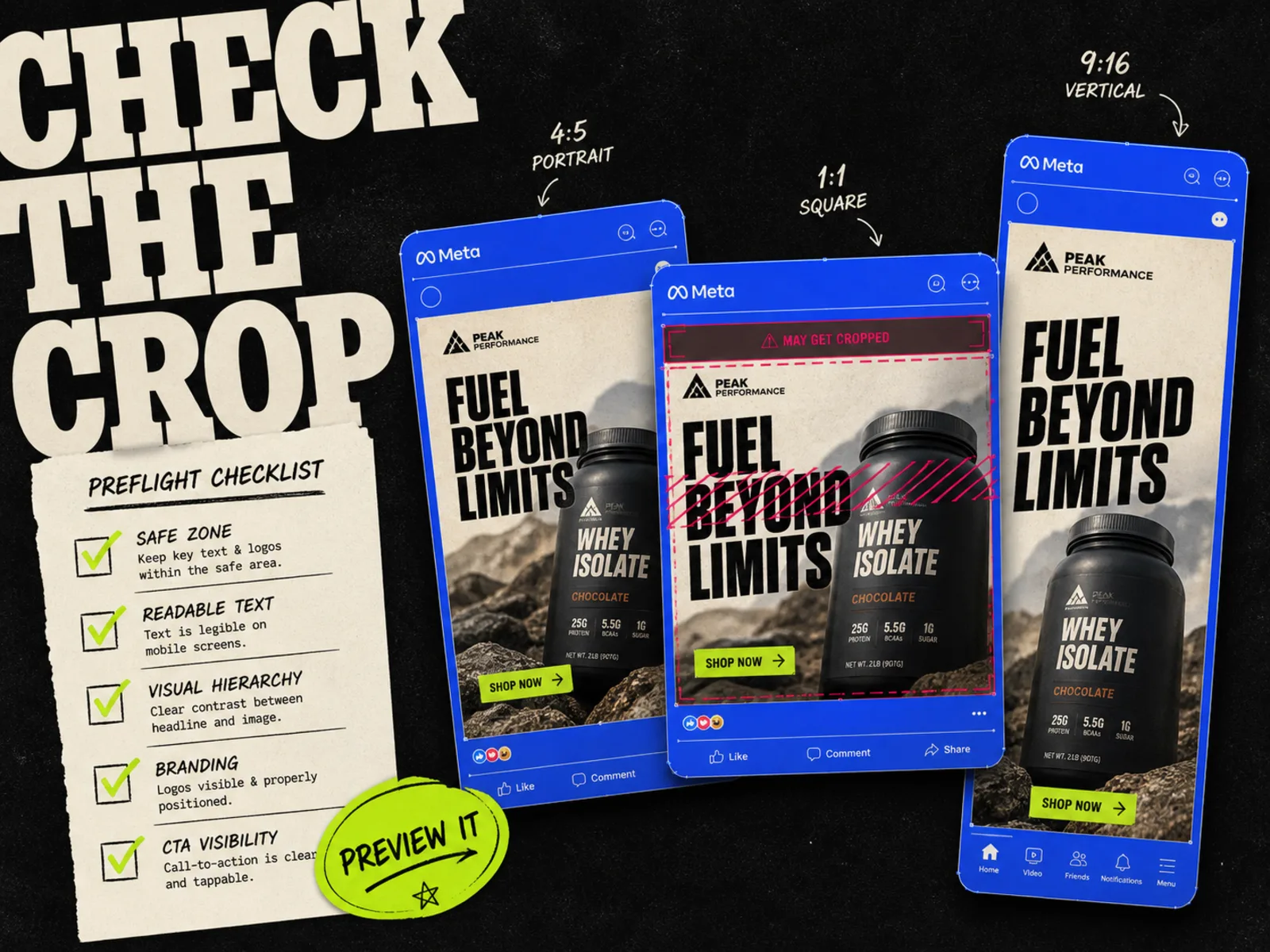
Open the 4:5, 1:1, and 9:16 versions together. Confirm that the hook, product, proof, logo, and offer are present in every composition that needs them. Look for accidental crops and layout changes that alter the message.
Then reduce each image to phone size. If the ad needs zooming to make sense, revise it now.
Check the full-screen safe area
Stories and Reels place interface elements around the edges of a 9:16 creative. Keep the important message away from the extreme top and bottom, then inspect the actual preview. There is no substitute for looking at the assembled placement.
Pay extra attention to price, legal copy, ratings, and built-in CTA graphics. Background texture can sit behind controls. Required information cannot.
Check the ad copy as one unit
Read the image, primary text, headline, and CTA in order. Repetition is common because different people write each part.
If the image says "Save 20% today," the headline probably does not need to say the same thing again. Use the headline to add the missing reason to click, such as the product category or delivery promise, as long as the claim is accurate.
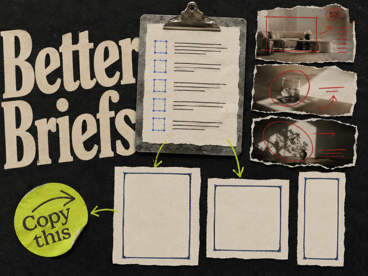
The ad creative brief template is useful here because it keeps the message and deliverables in one place before production begins.
Check the destination
Open the exact URL attached to the ad. Confirm that it loads, matches the offer, and lands on the expected product or collection. Check tracking parameters separately if your team uses them.
A polished preview can still hide a broken destination. The creative review is not complete until the click has somewhere sensible to go.
Check automatic enhancements
Meta can crop or expand images, adjust text, add music, animate a static image, or apply other eligible treatments when those options are enabled. Review the settings attached to the ad instead of assuming the uploaded file will run unchanged.
Turn off treatments that would make the test harder to read, or leave them on and accept that you are testing Meta's assembled version of the ad. Just do not forget they are enabled.
Check the launch state
For a new batch, creating ads in a paused state gives the team one last chance to inspect the real objects in Ads Manager. Confirm the campaign, ad set, identity, naming, URL, and copy before anything is switched on.
This matters most when several creatives are launched together. A correct first row does not prove the other nine have the right link.
Why one square preview is misleading
A square mockup is convenient for review decks because it fits almost anywhere. It is also a poor stand-in for the whole Meta placement set.
Feed gives a 4:5 creative more vertical room. Stories and Reels use a tall 9:16 frame with interface controls. When a team approves only the square version, the other formats often arrive late and get treated as resize work. That is when headlines shrink, products float in empty space, and CTAs collide with controls.
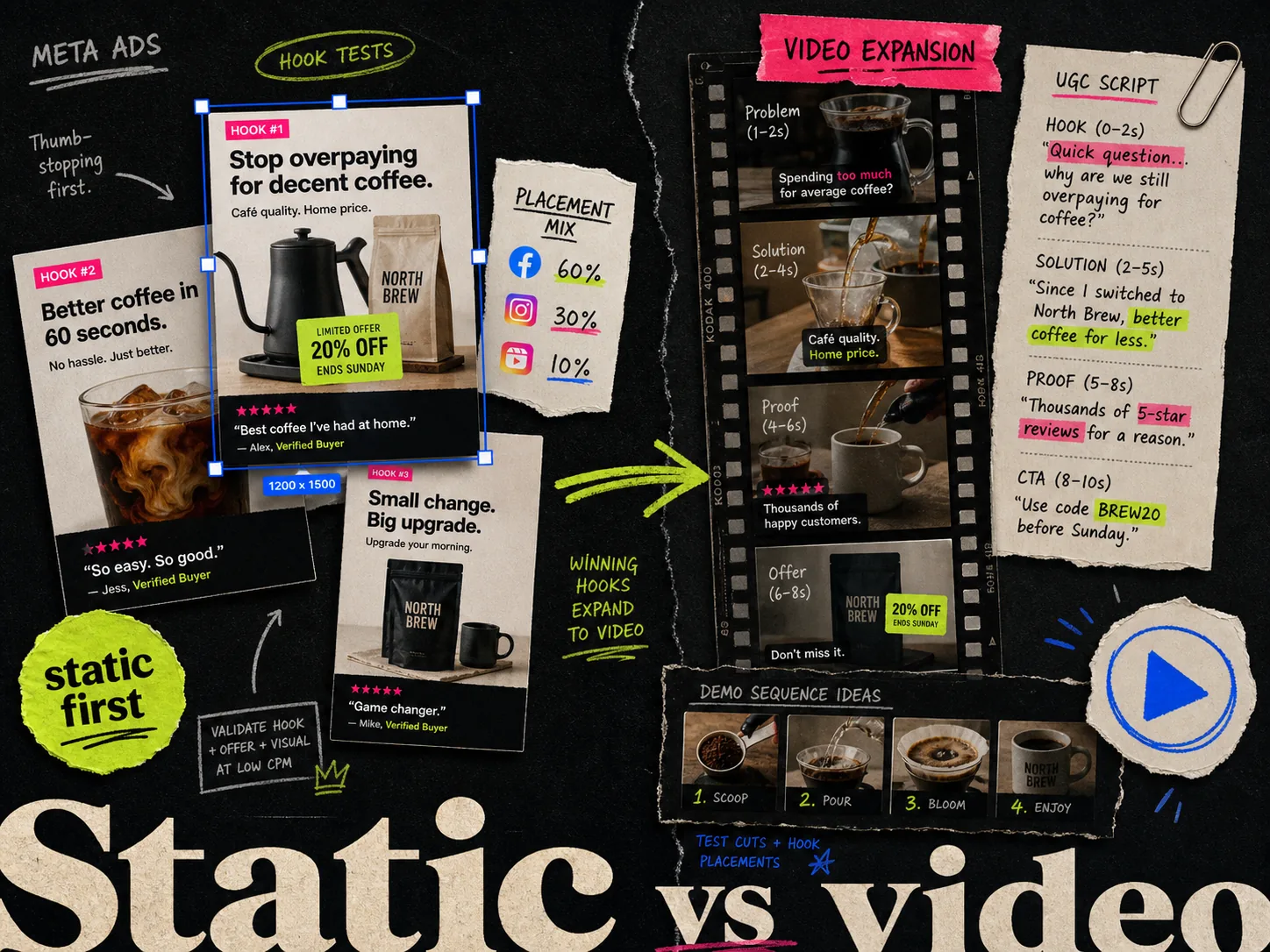
Approve the concept once, but preview every composition. This keeps placement adaptation separate from creative testing. Changing the arrangement to fit 9:16 does not automatically make it a new concept; changing the hook or offer does. The distinction is covered in our guide to static ads versus video ads on Meta.
A review workflow that does not slow down launch
Preview work becomes painful when feedback arrives in several tools. Keep the sequence short:
- 1.The designer or creative strategist checks the source files.
- 2.One decision-maker approves the message and claims.
- 3.The media buyer assembles the ad and reviews every selected placement.
- 4.The batch is created paused and checked once more in Ads Manager.
- 5.Only then does the campaign go live.
Give one person the final call. A crowded comment thread can spend an hour debating spacing while nobody notices that the destination points to last month's sale.
Previewing also belongs before performance testing, not inside it. A broken crop is a production error. It should not consume budget just to prove that covered text is hard to read. For the next stage, see the creative testing tools guide.
Where Adrio fits
Adrio handles the production side of the preview workflow. You can create and edit Meta static ads, review the 1:1, 4:5, and 9:16 compositions, and keep the text, product, logo, and CTA editable.
When the batch is ready, Adrio can send image creatives to a connected Meta campaign as paused ads. The launch flow reviews the destination, ad copy, names, and selected creative enhancements, then runs a preflight check before creating anything.
That still does not remove the final Ads Manager preview. Adrio helps you reach that step with deliberate files and paused ads instead of a folder of unlabeled exports. The platform preview remains the right place to inspect Meta's assembled rendering.
FAQ
What is the best creative preview tool for Meta ads? Use your design or ad-production tool to review the source creative, then use Meta Ads Manager to inspect the assembled ad across selected placements. The two checks catch different problems.
Can I preview a Facebook ad without publishing it? Yes. Build the ad in Ads Manager and use its placement previews before the ad is active. Teams may also use Creative Hub for mockup review when it is available in their account.
Why does my Meta ad look different from the uploaded image? The delivered ad includes Page identity, copy, a CTA, and placement-specific interface elements. Enabled creative enhancements may also crop, expand, animate, or otherwise treat the source asset.
Which placements should I preview? Preview every placement selected for the ad. At minimum, inspect the relevant Facebook and Instagram Feed, Stories, and Reels views rather than approving one generic mockup.
Do I need separate files for Feed, Stories, and Reels? Separate 4:5, 1:1, and 9:16 compositions give you more control than asking Meta to adapt one square file. Simple photography may resize well, but text-heavy static ads usually need deliberate layouts.
Should I create ads paused before launch? For batches and team workflows, paused creation is a useful safety step. It lets you check the real campaign, ad set, identity, copy, URL, and enhancements before the ads can spend.