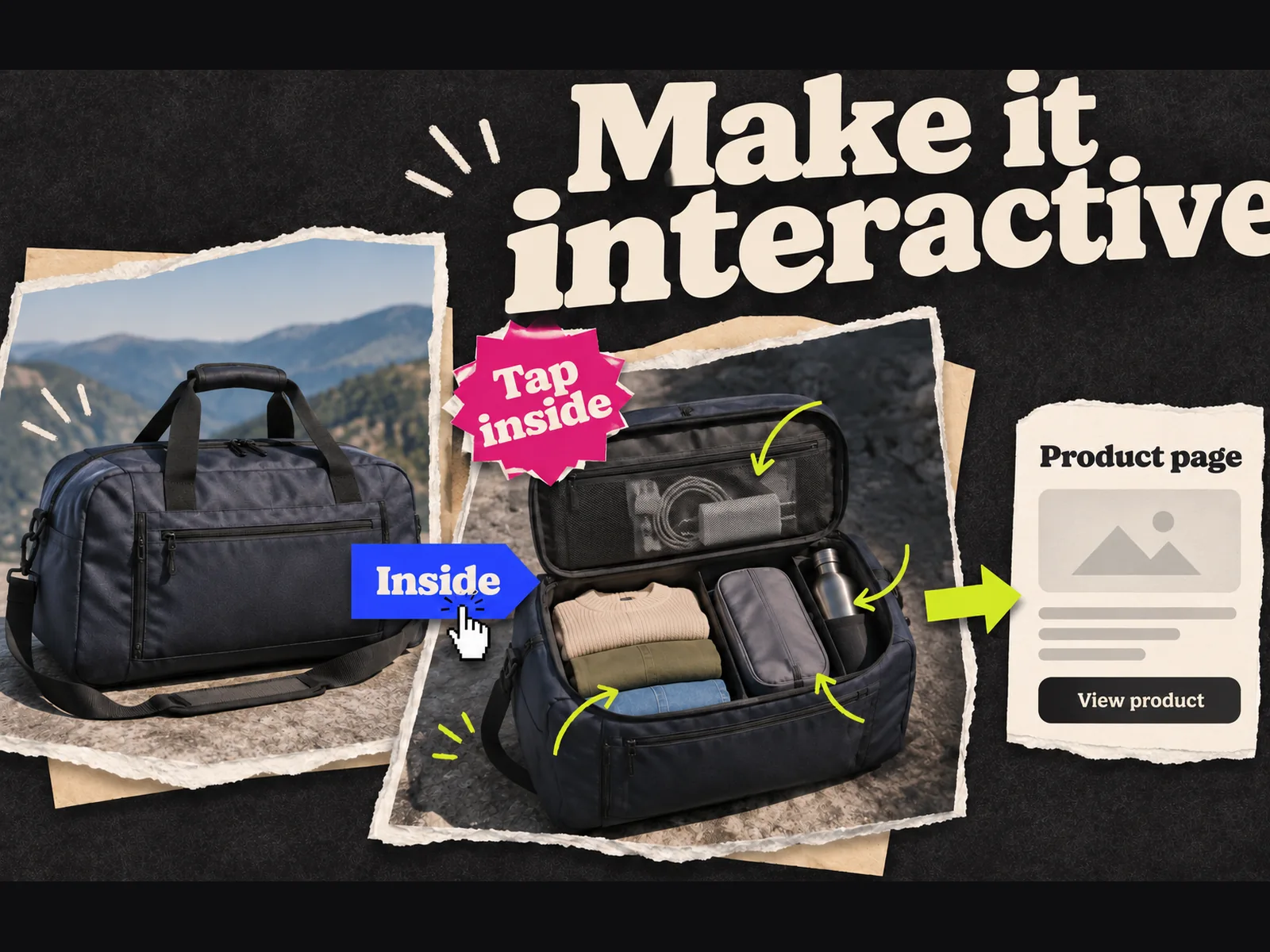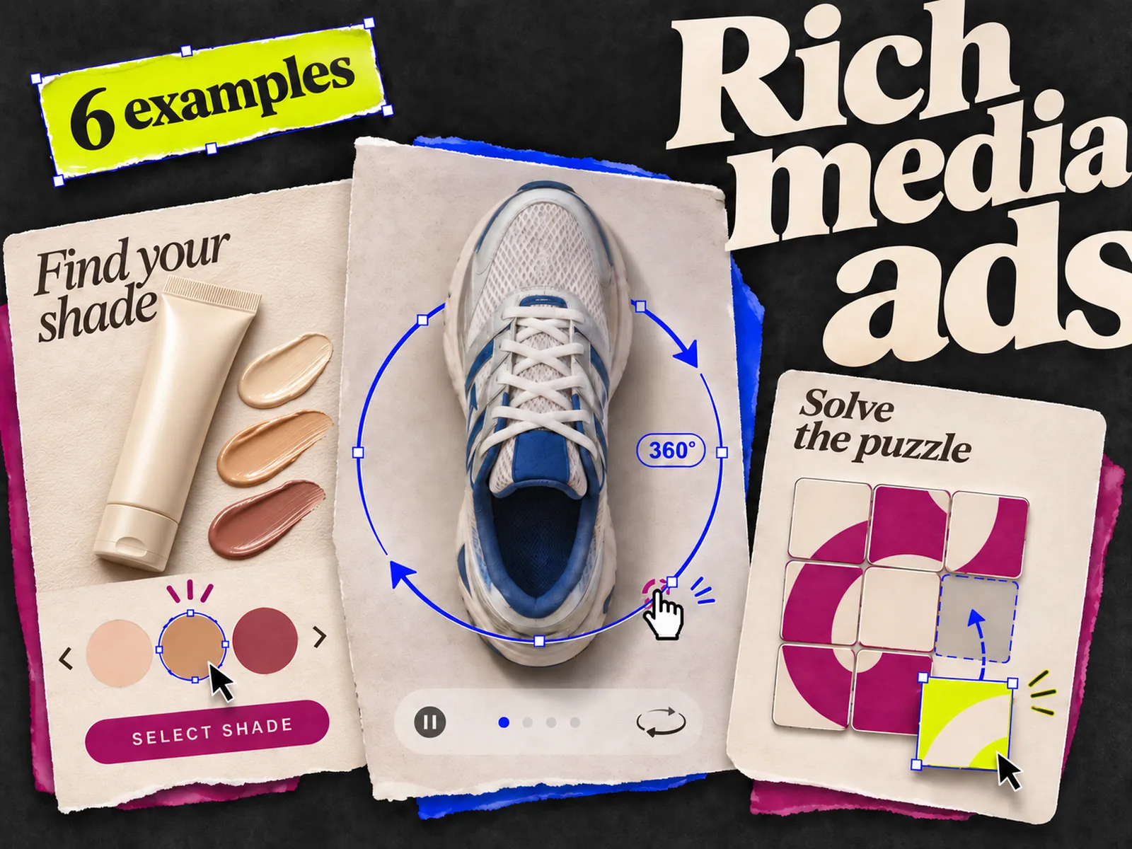
A rich media ad earns its space when the interaction helps someone inspect a detail, try a small part of a product, or choose what to see next. Sometimes a still image answers the question faster.
These six examples are *illustrative briefs*. They are not screenshots of live campaigns, and they make no claims about results. Each has a first frame, one action, and a way out. For actual campaigns, browse Google's Rich Media Gallery. Its archive is useful for ideas; check current specifications before building from an older creative.
If you need the definition and format list first, read what rich media ads are. If you already have a concept and need to build it, use the rich media production guide.
| Example | What the person can do | Best question for the format |
|---|---|---|
| Makeup shade cards | Switch between approved product photos | Can I inspect the range without opening a new page? |
| Rotating running shoe | Turn a model to see the sole and heel | Does the shape need more than one angle? |
| Expandable train itinerary | Open a route and inspect its stops | Is the route itself the reason to book? |
| Furniture detail gallery | Choose a material and see a close-up | Which detail is hard to show in one frame? |
| Playable puzzle | Try one real game mechanic | Is the action fun and legible in seconds? |
| In-banner product video | Play a short demonstration | Does motion answer a question a photo cannot? |
1. Makeup shade cards: let people inspect the range
Picture a compact display banner for a makeup brand. It shows one product, a plain label such as "See the shades," and three labeled shade chips. Tapping a chip swaps the product photo and shade name. A separate "View all shades" exit leads to the verified product page.
The range is the message here. The idea falls apart if every shade looks identical in the photos, or if the ad implies a shade will suit someone's skin without evidence. Use approved packshots and names; do not invent colors or match claims to fill the layout.
The static fallback is one product image with a clear route to the full range. In the interactive unit, count shade selections and exits separately. A tap shows interest in a shade; it does not tell you whether someone found a match.
2. Rotating shoe: show the part a flat photo hides
For a running shoe, start with a strong side view and a visible "Rotate" control. The person drags the shoe to inspect the outsole, heel, and upper. The product name and exit stay visible while the model moves.
Google's 3D Swirl format is a real example of a display unit that lets people rotate a 3D model. That does not mean every placement accepts one. Confirm the inventory and asset requirements before commissioning a model.
Would another angle settle a real doubt? If the outsole is the selling point, label it and make that view easy to reach. If one approved photo tells the story, the 3D model may be expensive decoration. Keep a still image ready for placements that cannot serve the interaction.
3. Expandable itinerary: put the route inside the ad
A rail operator could start with a city pair, a journey time from its approved timetable, and a button labeled "See the stops." Opening the panel reveals a short route map and the departure options approved for this campaign. The booking exit stays distinct from the expand control.
The first frame must make sense on its own. A person should not have to open a panel to discover which trip is being advertised. This format works only if the route detail helps them decide whether to continue. It is a poor fit for a generic "Travel more" message.
Expandable formats need platform and publisher checks early. Google's Display & Video 360 HTML5 guide directs advanced expandable work toward Studio. Do not promise this unit to a client before the media buyer confirms where it can run. For the fallback, use a clear route image and a booking link.
4. Furniture gallery: answer one material question
Suppose a sofa maker has approved photos of the same model in three fabrics. The banner opens on the sofa in a room. A labeled material control switches to a close-up of the chosen fabric, then returns to the full sofa view. The landing page shows the same model and materials.
Don't turn a tiny banner into a full catalog. Three materials are enough to learn whether the interaction helps; dozens would bury the product and slow down the asset review. Keep the product name and primary message fixed as the images change.
A static version can show a single close-up beside the sofa. In the interactive version, measure material selections and exits. If people inspect a fabric but rarely move to the product page, check whether the close-up answers the question or merely invites another tap.
5. Playable puzzle: let the mechanic speak
For a mobile puzzle game, show an actual level state, one obvious move, and a short prompt such as "Move the blue tile." After the move, show what happened and offer an install exit. The playable slice should resemble the game. A bait-and-switch mini-game teaches the wrong expectation.
Think of this as a tiny product trial. If the first move requires a tutorial, simplify the level. Test it on a phone with no coaching. Provide a still or video fallback for inventory where a playable unit is unavailable.
Record starts, completed moves, and exits if the chosen ad platform supports those events. Google's Studio custom-metrics guide distinguishes counters, exits, and timers. Agree on the event names before development so a "play" count does not mix a first tap with a completed level.
6. In-banner video: show the operation, then stop
Imagine a kitchen tool whose action is hard to understand in a photo. The opening frame shows the product and a visible play control. The short clip shows one use, then leaves a readable product frame and exit. Captions carry the point when sound is off.
Google's rich media guidance includes in-banner video. Its creative guidelines prohibit autoplay audio and allow autoplay video only when muted. Exact publisher rules can be tighter, so check the intended placement before final export.
The fallback is a still that shows the result of the action. A video play is not the same as an exit, and neither proves a sale. Check whether the clip actually improves understanding. If the first and last frames tell the whole story, a static ad might be the cleaner choice.
How to choose an example for your brief
Start with the buyer question, then pick the smallest interaction that answers it. Shade selection fits a range question; rotation fits a shape question. A playable lets someone judge the game mechanic. If your brief cannot name the question, it is too early to choose a format.
Write down the first frame, the action, the exit, and the fallback before asking a designer to build anything. The ad creative brief template covers the core message and evidence; add those four fields for an interactive unit. Confirm the destination, event tracking, asset limits, and publisher support with the trafficking team. Google's Display & Video 360 documentation lists rich media features and tracking, but the acceptable package depends on the placement.
These examples are for display or app inventory that supports rich media. A Meta Feed ad is a different deliverable. If the same concept must run on Meta, carry over the buyer question: shade cards could become a carousel, the shoe rotation a short video, and the itinerary a static route comparison. Adrio can help research references and make Meta static or video variants from an approved brief; the HTML5 rich media unit still needs the production and trafficking workflow chosen for its inventory.
Before approving a rich media concept, look at the first frame without touching it. If it says nothing useful until the animation starts, fix the message there first.