A rich media ad can let someone open a product detail, compare two items, or play a short demonstration inside a display placement. That extra action is useful only if it helps the person understand the offer. If the ad needs a paragraph of instructions before anyone knows what to tap, simplify it.
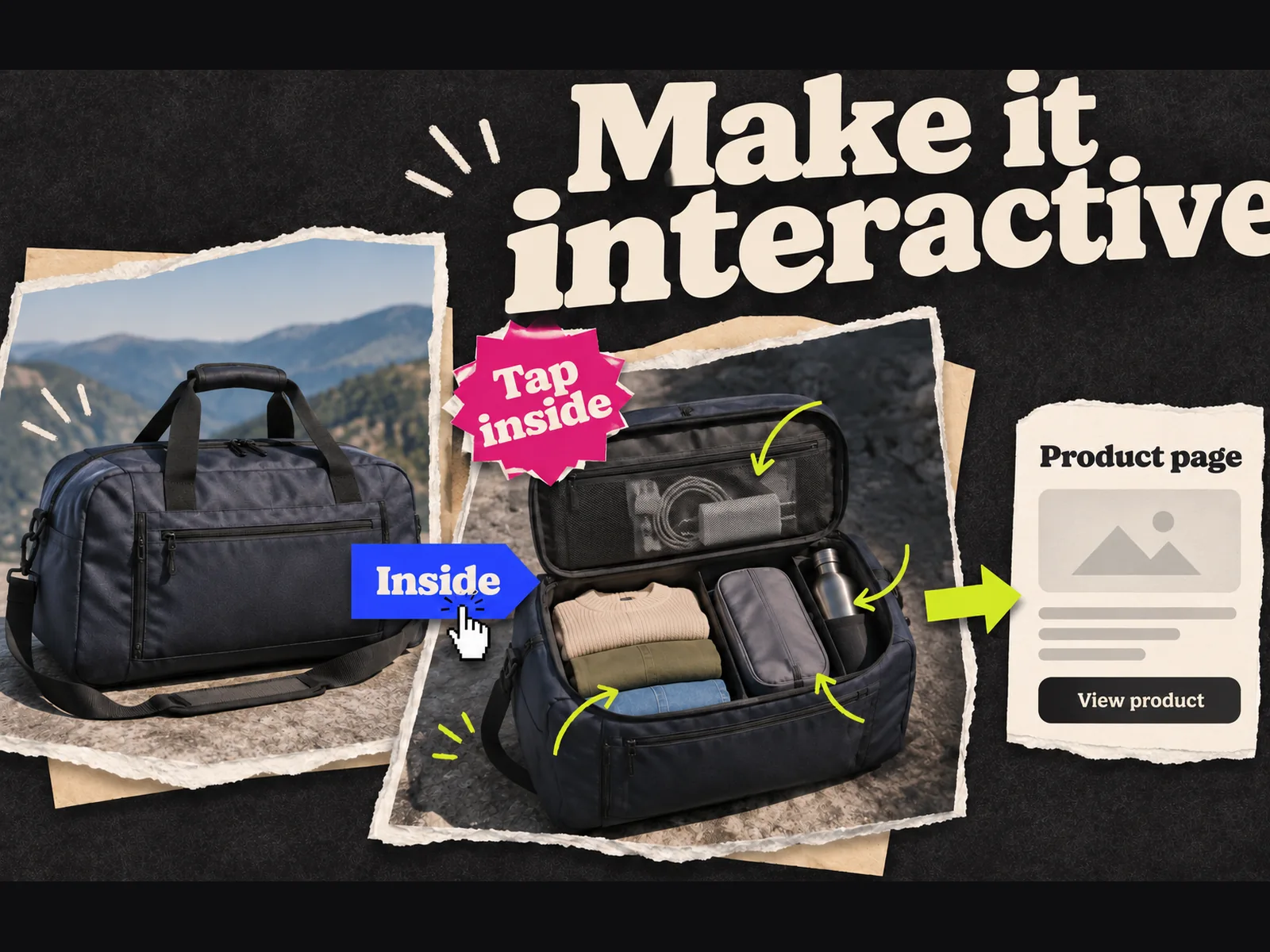
This guide follows one example from brief to preview: an interactive display banner for a fictional travel-bag brand. The viewer can switch between a closed bag and an open view of its compartments. The example is a production exercise, not a campaign result. It assumes a web or app display placement that accepts an HTML5 creative; the exact technical rules depend on where you buy the inventory.
If you first need a definition or a tour of formats, read what rich media ads are. Here, the job is to make one.
Decide whether interaction earns its place
Write the buyer question before picking a format. For the travel bag, it is: "Will my laptop and clothes fit without becoming one messy pile?" A still image might answer that with a clear cutaway. If it does, ship the still. Interaction earns its production cost when the viewer benefits from controlling the comparison, seeing a detail on demand, or trying a small piece of the experience.
Keep the intended placement in view. An expandable unit, an in-banner video, and a clickable gallery have different production and trafficking needs. Google's Display & Video 360 HTML5 creative guide describes both standard HTML5 display and rich media features, and points advanced expandable or interstitial work toward Studio. Choose the destination and format with the media buyer before a designer builds the first frame.
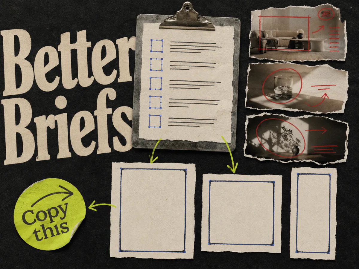
The ad creative brief template is a starting place. Add four details that an interactive unit needs:
| Brief field | Travel-bag example |
|---|---|
| One message | See how the bag separates a laptop from clothes |
| First frame | Closed bag, readable promise, clear way to open the comparison |
| Interaction | Tap "Inside" to reveal the compartment view; tap "Outside" to return |
| Exit | A separate "See the bag" action opens the verified product page |
The product images, dimensions, and any capacity claim must come from the brand's approved materials. The table describes what to brief, not facts about a real bag.
Sketch the states before opening a design tool
Draw the unit as three small frames on paper: initial view, inside view, and exit state. Label what changes and what stays put. The price, offer, and call to action should not quietly change when someone taps between views.
For a first version, give the viewer one thing to do. They tap a labeled control, see a useful detail, and can still reach the landing page. A maze of panels hides the destination. If the buying reason only appears after three taps, the first frame is doing too little work.
Think about touch from the start. A hover-only reveal has no obvious equivalent on a phone. Put the action on a visible button and leave room for a finger to use it. Test the smaller placement as carefully as the generous desktop mockup. The short headline and product should still make sense before anyone interacts.
Build a small HTML5 prototype
Google Web Designer's banner setup guide starts with the ad environment and dimensions, then lets you choose a responsive layout or a fixed size. Use the environment and sizes agreed with the trafficking team. Build the first frame with approved product images, then add the inside/outside control and the exit action.
An HTML5 ad is a package of HTML, CSS, JavaScript, and assets. In Display & Video 360, the creative requirements include an exit or click tag in the main HTML file. They also call for a backup image uploaded separately. Have the person who will traffic the ad check the package before final export; the correct destination and click tracking matter as much as the animation.
Keep the source file and published package separate. Google Web Designer's publish guide explains that publishing creates the files used for trafficking and offers validation in the publish dialog. A source project that looks fine in the editor is not the deliverable.
If the brief requires expansion, in-banner video, a form, or a game, stop and confirm the platform and publisher requirements with the media buyer. Those features can require a different workflow. A two-state banner is a better first prototype than an elaborate unit built for inventory that cannot run it.
Preview the whole interaction
Use the design tool's preview mode. Google warns against opening the authoring HTML file directly, because that does not provide a faithful preview of the published ad. Open the preview at the planned sizes and, when possible, on a phone.
Run through the ad as a visitor would:
- 1.Can you understand the product and promise without tapping?
- 2.Is the control visible, and does its label describe the result?
- 3.Does the inside view show the intended detail without obscuring the product?
- 4.Can you return to the first view?
- 5.Does the exit open the correct product page?
- 6.Does the unit remain readable if the interaction never happens?
Check the awkward cases too: an image loads late, the text wraps, or a tap lands near the edge. The interaction should not strand the viewer or turn the call to action into an accidental click target. Ask a teammate who has not seen the storyboard to try it without coaching. Watch their first tap. It tells you more than another designer's approval of the layout.
Decide what to measure before launch
A rich media unit can report more than a destination click. Display & Video 360's HTML5 documentation describes interaction counts, exits, and timers for supported rich media creatives. Agree with the trafficking team on which events your particular unit can record and what each event means. An "inside" tap shows curiosity about a detail; it does not prove purchase intent.
For the travel-bag example, keep the measurement plan modest: delivery, inside-view interactions, exits to the product page, and the campaign outcome already used for the placement. Record the definition of each metric. If the interaction rate rises while useful visits fall, the novelty may be distracting from the offer. If few people tap but the first frame drives qualified visits, the interactive layer may be unnecessary.
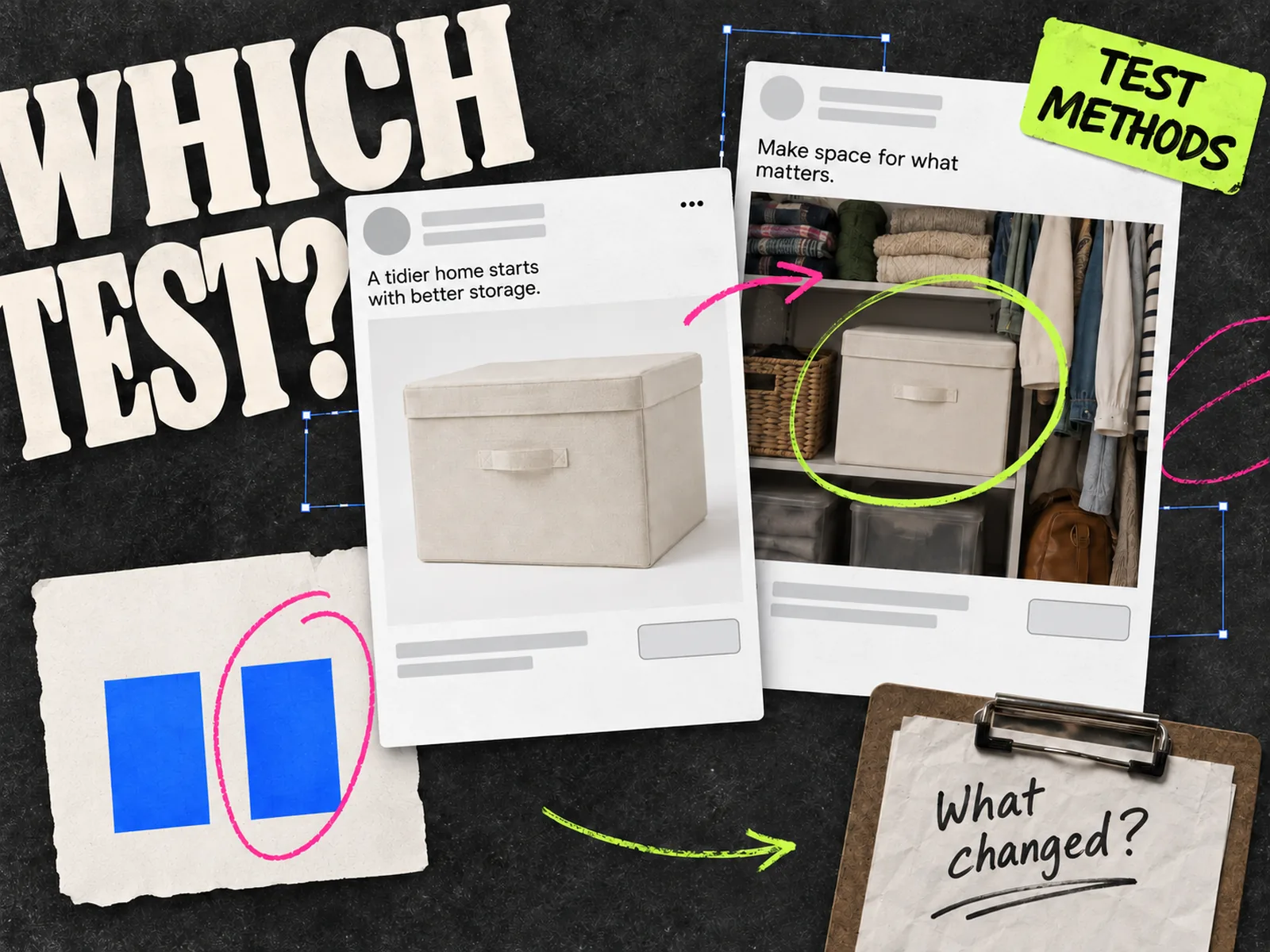
Compare the unit with a simpler version when the account has enough delivery to support the question. Keep the offer and destination aligned, and write down differences in placement or audience. A rich media ad shown in one inventory pool and a static ad shown in another is an observation, not a clean format test. The ad testing methods guide helps choose the right comparison.
Adapt the idea for Meta
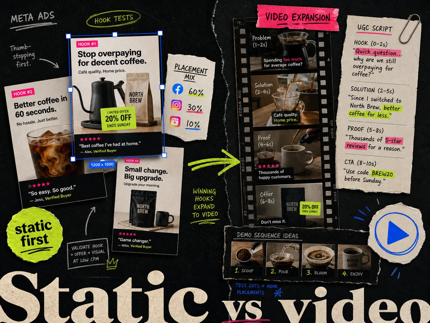
An interactive HTML5 display unit is a different deliverable from a Meta Feed image or Reel. If your campaign also runs on Meta, adapt the *idea* rather than sending the display package into that workflow. The bag's inside/outside comparison could become a static side-by-side image, a carousel sequence, or a short video. The static versus video guide helps choose between those native treatments.
Adrio can help research references and produce static or video Meta ads from an approved direction. Use the same verified product facts and buyer question when you brief those assets. Build and traffic the HTML5 unit in the display tools selected for that placement.
Before handoff, check the first frame, the interaction, and the published package in the intended placement. The open-bag view either answers the compartment question or it doesn't. Another animation will not make a vague product claim clearer.